🏠 The Home of Cricket on CREX : From Match Updates to a Full-Fledged Cricket Hub
🏠 The Home of Cricket on CREX : From Match Updates to a Full-Fledged Cricket Hub


In May 2025, we launched the New Home screen in CREX — a unified, personalised hub for cricket fans to explore matches, videos, news, and rankings all in one place. I co-led the design effort.
We designed it with a strong focus on content, but I also saw an opportunity—to go beyond just updates and reflect real cricket fan emotions too. The launch led to 50%+ of all content consumption happening via Home, with over 50M swipes, 3.5M news reads, and strong engagement across videos and shorts. It turned CREX from a tool into a destination.
In May 2025, we launched the New Home screen in CREX — a unified, personalised hub for cricket fans to explore matches, videos, news, and rankings all in one place. I co-led the design effort.
We designed it with a strong focus on content, but I also saw an opportunity—to go beyond just updates and reflect real cricket fan emotions too.
The launch led to 50%+ of all content consumption happening via Home, with over 50M swipes, 3.5M news reads, and strong engagement across videos and shorts. It turned CREX from a tool into a destination.
📌 The Context
📌 The Context
Until early 2025, CREX had no Home screen. Users jumped straight into the match experience or specific content sections through navigation tabs or notifications.
Until early 2025, CREX had no Home screen. Users jumped straight into the match experience or specific content sections through navigation tabs or notifications.
As CREX evolved into a multi-format content platform — with videos, news, shorts, rankings, and stories — it became clear that we needed a centralised surface to unify discovery and navigation.
As CREX evolved into a multi-format content platform — with videos, news, shorts, rankings, and stories — it became clear that we needed a centralised surface to unify discovery and navigation.
We launched the first-ever Home screen in CREX just before Champions Trophy 2025 — a personalised, content-rich surface that reflects everything cricket fans care about in one place.
We launched the first-ever Home screen in CREX just before Champions Trophy 2025 — a personalised, content-rich surface that reflects everything cricket fans care about in one place.
Launch: May 2025 (pre-Champions Trophy)
My Role: Co-designer (team of 2)
Launch: May 2025 (pre-Champions Trophy)
My Role: Co-designer (team of 2)
🎯 The Problem
🎯 The Problem
CREX had grown into a content-rich platform, but:
CREX had grown into a content-rich platform, but:
There was no unified surface to showcase it all
There was no unified surface to showcase it all
Users often missed important updates if they skipped notifications
Users often missed important updates if they skipped notifications
Navigation to features like rankings & venue was not intuitive
Navigation to features like rankings & venue was not intuitive
We needed to build Home from scratch — not just as a navigational hub, but as a surface that:
We needed to build Home from scratch — not just as a navigational hub, but as a surface that:
Highlights key cricket moments and updates
Highlights key cricket moments and updates
Connects all important sections of the app
Connects all important sections of the app
Celebrates cricket and reflects the evolving identity of CREX
Celebrates cricket and reflects the evolving identity of CREX
💡 Why This, Why Now?
💡 Why This, Why Now?
Our content was scattered across the app — videos here, news there, rankings buried somewhere else. Users often relied on notifications and still missed key updates. Got User feedbacks about discoverability challenges
Our content was scattered across the app — videos here, news there, rankings buried somewhere else. Users often relied on notifications and still missed key updates. Got User feedbacks about discoverability challenges
And it wasn’t just a user problem. Internally, the founder himself triggered the idea — calling for a space that brings everything together, visibly and functionally.
And it wasn’t just a user problem. Internally, the founder himself triggered the idea — calling for a space that brings everything together, visibly and functionally.
Videos has a dedicated tab for it
News in all player & series profiles

Rankings & Stats in search

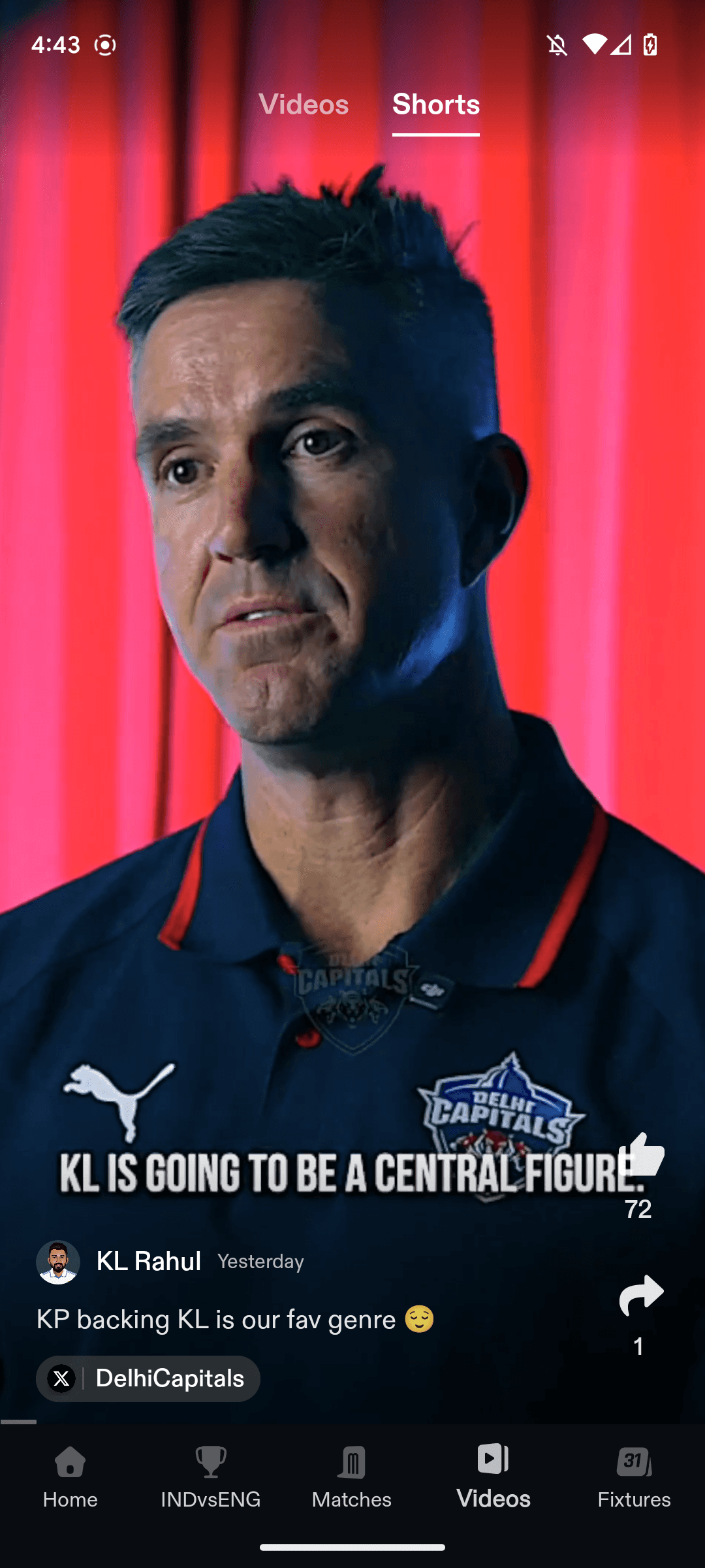
Shorts integrated within videos tab
🔬 Research & Insights
🔬 Research & Insights
We started with both qualitative and quantitative research:
We started with both qualitative and quantitative research:
📊 Data Analysis
📊 Data Analysis
Mapped out user navigation patterns
Mapped out user navigation patterns
Identified the most visited sections
Identified the most visited sections
Identified underexposed but high-performing content
Identified underexposed but high-performing content
🗣️ Internal Fan Groups & Beta Users
🗣️ Internal Fan Groups & Beta Users
We spoke to our most active users and teammates who are hardcore cricket fans to understand:
We spoke to our most active users and teammates who are hardcore cricket fans to understand:
What they find missing in the app
What they find missing in the app
What they frequently use in app
What they frequently use in app
What felt “buried” in the app
What felt “buried” in the app
🔎 Key Insights
🔎 Key Insights
Majority of users frequently see schedule, matches & updates of their national team
Majority of users frequently see schedule, matches & updates of their national team
They rely heavily on notifications for breaking updates— and often miss them
They rely heavily on notifications for breaking updates— and often miss them
Personalisation is key — no two fans care about the same teams or players
Personalisation is key — no two fans care about the same teams or players
The match discovery experience must remain simple and quick
The match discovery experience must remain simple and quick
Rankings and search were often hard to find — yet heavily used
Rankings and search were often hard to find — yet heavily used
✍️ Designing the Experience
✍️ Designing the Experience
We approached the design as a modular system — where each block on Home could deliver value independently, but collectively create a comprehensive fan experience.
We approached the design as a modular system — where each block on Home could deliver value independently, but collectively create a comprehensive fan experience.
Based on the research we first listed out every section that deserved a place on Home: Matches, News, Videos, Rankings, Series & more.
Based on the research we first listed out every section that deserved a place on Home: Matches, News, Videos, Rankings, Series & more.
To celebrate cricket & give the important updates of the day we decided to create a hero section that deliver all the things.
To celebrate cricket & give the important updates of the day we decided to create a hero section that deliver all the things.
🎨 Designing the Header
🎨 Designing the Header
We knew the top of Home needed to make a statement — emotionally and functionally.
After multiple iterations, we landed on a vertical carousel layout that could highlight:
We knew the top of Home needed to make a statement — emotionally and functionally.
After multiple iterations, we landed on a vertical carousel layout that could highlight:
Player & Team Milestones
Player & Team Milestones
Breaking news
Breaking news
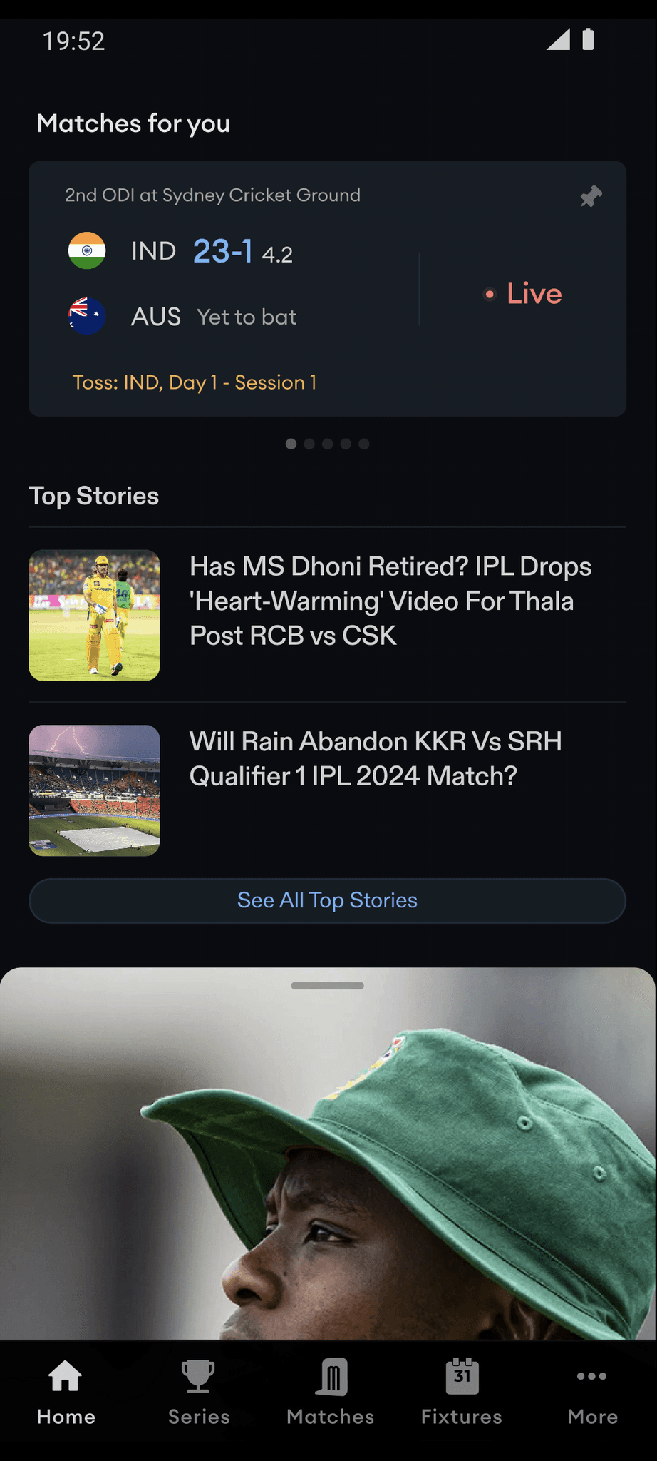
Upcoming & Live Matches
Upcoming & Live Matches
Celebrate big tournament
Celebrate big tournament
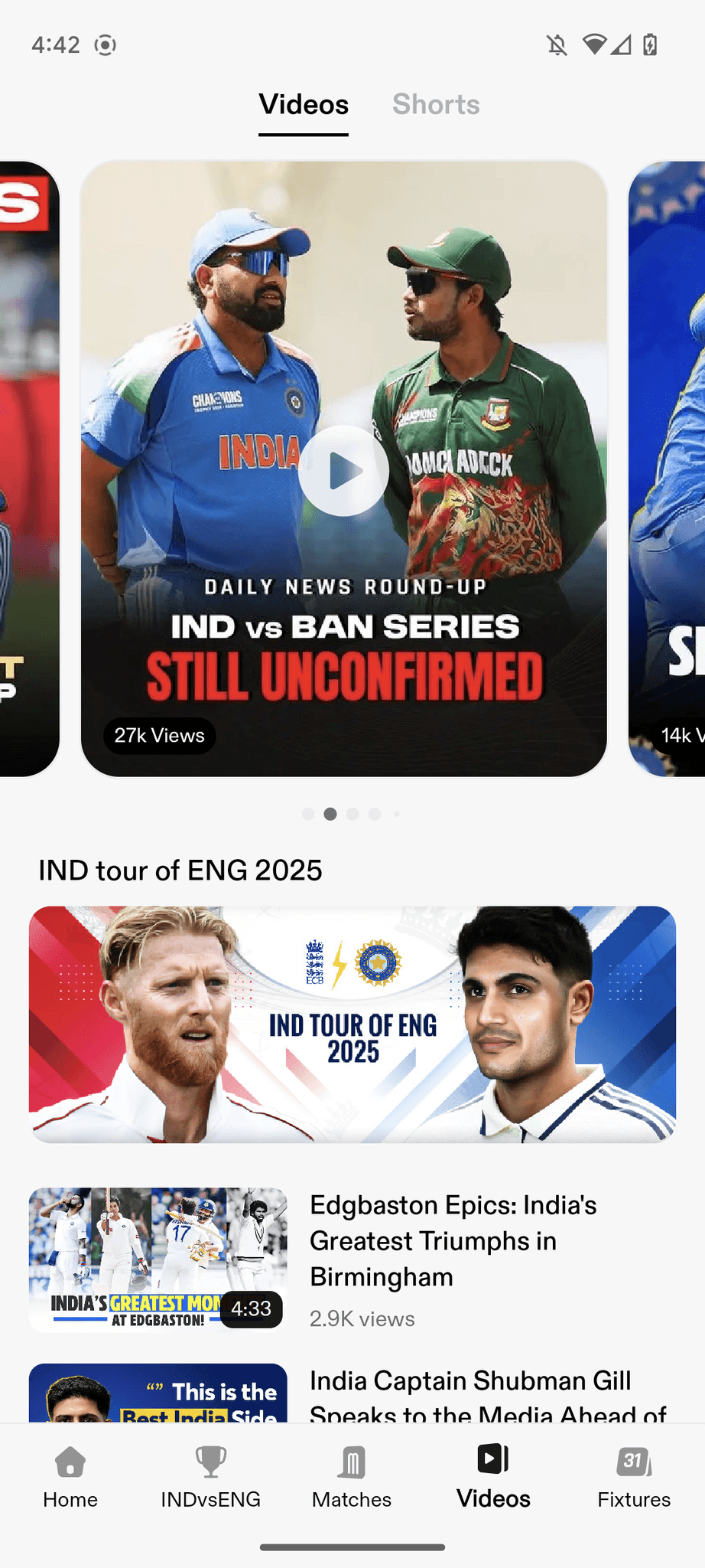
Feature trending shorts & videos
Feature trending shorts & videos
It became our hero area, updated dynamically in real time, controlled from the backend.
It became our hero area, updated dynamically in real time, controlled from the backend.
Iteration 1
Iteration 2

Iteration 3

⚡ Quick Navigation Section
⚡ Quick Navigation Section
We introduced a personalised, scrollable shortcut row just below the header — letting users jump to: National team profiles, Ongoing series, rankings, search, news & more
We introduced a personalised, scrollable shortcut row just below the header — letting users jump to: National team profiles, Ongoing series, rankings, search, news & more
After the home header we decided to show featured matches as it's the core usecase of the application.
After the home header we decided to show featured matches as it's the core usecase of the application.
⚙️ Match Card Optimization
⚙️ Match Card Optimization
We already had detailed match cards under the “Matches” tab. But Home needed something lighter. We created a horizontal carousel of minimal match cards, showing just the essentials. Users could view 2 at a time — prioritized by:
We already had detailed match cards under the “Matches” tab. But Home needed something lighter. We created a horizontal carousel of minimal match cards, showing just the essentials. Users could view 2 at a time — prioritized by:
Match Popularity
Match Popularity
User’s country or preferred teams
User’s country or preferred teams
Iteration 1

Iteration 2

Iteration 3

🧱 Reusable Components & Layout Ordering
🧱 Reusable Components & Layout Ordering
For consistency, we reused component styles from other sections: News & Video Cards, Shorts Layout, Rankings & Series
For consistency, we reused component styles from other sections: News & Video Cards, Shorts Layout, Rankings & Series
We weren’t sure about the ideal section order — so we made it all configurable via backend.
We weren’t sure about the ideal section order — so we made it all configurable via backend.
We experimented with different sequences and finalized the one with the highest engagement after a few weeks of live testing.
We experimented with different sequences and finalized the one with the highest engagement after a few weeks of live testing.
📈 The Results
📈 The Results
We launched Discussions in Champions Trophy 2025 — the perfect time to test engagement.
We launched Discussions in Champions Trophy 2025 — the perfect time to test engagement.
50%+ of all content consumption now happens via the Home screen, We saw:
50%+ of all content consumption now happens via the Home screen, We saw:
3.5M+ News Reads
3.5M+ News Reads
2.3M Shorts Views
2.3M Shorts Views
1.5M Video Views
1.5M Video Views
50M+ Swipes on Featured Home Posts
50M+ Swipes on Featured Home Posts
13M+ Series & Team Opens
13M+ Series & Team Opens
🧩 Challenges We Faced
🧩 Challenges We Faced
Getting the header right — balancing information with emotion, Ensuring alignment with the content team on what to feature. We arranged a weekly sync with content team for 3 months for consistent quality check & track the performance
Getting the header right — balancing information with emotion, Ensuring alignment with the content team on what to feature. We arranged a weekly sync with content team for 3 months for consistent quality check & track the performance
Designing match posters at scale — solved by using AI-generated player images as we don't have licensed player images
Designing match posters at scale — solved by using AI-generated player images as we don't have licensed player images
As designers, we had to step into process planning as much as interface work — ensuring the right pipelines were built for content and graphics.
As designers, we had to step into process planning as much as interface work — ensuring the right pipelines were built for content and graphics.
🧠 What We Learned
🧠 What We Learned
Great design needs cross-team alignment
Great design needs cross-team alignment
Content-led experiences need strong operational support
Content-led experiences need strong operational support
The first impression of your app is worth obsessing over
The first impression of your app is worth obsessing over